5. Tutorial 01- Creating first ''Custom Widget''.
Simple widget implementation
The first widget that we will create will be trivial. This will be a widget that displays color information in a non-standard way.
The idea is, that by creating the object of our widget and passing a color to it, displays the appropriate information.
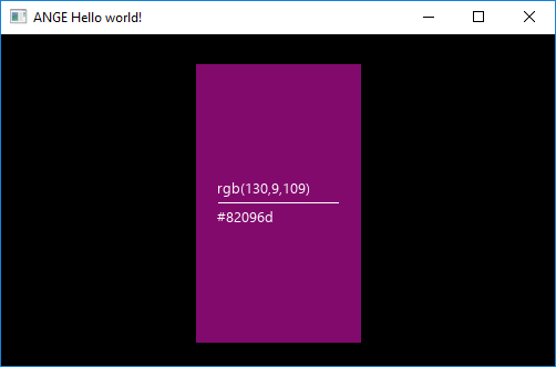
The final effect will look like this:
During the implementation, we will use the "CustomWidget" class available in the ANGE library. This class includes the implementation of the basic functions of each widget in the engine, so it saves us a lot of time and code lines.
So, we will start with a skeleton class like this:
class ColorInfo : public CustomWidget
{
}
We also need two functions: constructor and function that sets the color of the widget. In the constructor we will create a view of our widget and in the SetColor function we will update the view state. Because we will add all dynamically created widgets to the list of internal widgets using the AddComponent(int, Widget2D *) function, we will not have to write our own destructor, copy constructor or assignment operator - lets the functions from the base class handle all that stuff.
class ColorInfo : public CustomWidget
{
	ColorInfo(Window* window, Widget2DProps props, TextTheme theme)
		: CustomWidget(window, props)
	{
	}

	void SetColor(Color color)
	{
	}
}
Let's move to the constructor implementation. We wiil add all created objects to the m_Components list, on which all implemented base functions of the CustomWidget class depends. Individual issues are described in the code.
ColorInfo(Window* window, Widget2DProps props, TextTheme theme)
		: CustomWidget(window, props)
	{
		//Create reference point - The idea is to make the added components independent from the anchor flag of the entire widget.
		Point translated = props.Position;
		TranslateAnchor(translated, props.iFlags, Anchor::Left | Anchor::Bottom);
		Point middlePos = translated + Point{ 20, (int)props.Dimensions.tHeight / 2 };

		//Get theme font size
		int fSize = theme.iFontSize;

		//Create Background
		AddComponent(CI_BG, new Background(window, props, BackgroundTheme{ Color(0,0,0,255),Color{0,0,0,0}, {0,0} }));

		//Create Line
		AddComponent(CI_LINE, new Background(
			window,
			{ middlePos, {props.Dimensions.tWidth - 40, 1}, Anchor::Left|Anchor::Bottom},  //Some dimension calculations
			BackgroundTheme{ Color(255,255,255,255),Color{0,0,0,0}, {0,0} }
		));

		//Add Text
		AddComponent(CI_TEXT, new Text(
			window,
			{ middlePos + Point{0,4},{ props.Dimensions.tWidth, (size_t)theme.UsedFont->GetLineHeight(fSize) } }, //Some position calculations (middlePos + 4pixels to the top)
			theme,
			L"rgb(0,0,0)")
		);

		AddComponent(CI_TEXT_HEX, new Text(
			window,
			{ {middlePos + Point{0, -4 - theme.UsedFont->GetLineHeight(fSize)}}, { props.Dimensions.tWidth, (size_t)theme.UsedFont->GetLineHeight(fSize) } }, //Some position calculations
			theme,
			L"#000000")
		);
	}
In addition, we must add such definitions to the file:
#define CI_BG			1001
#define CI_LINE			1002
#define CI_TEXT			1003
#define CI_TEXT_HEX		1004
Now it's time for our SetColor(Color) function:
void SetColor(Color color)
{
	//Change background color
	auto bg = (Background*)GetComponent(CI_BG); //Get object by ID.
	bg->SetColor(color);

	//Change line & text color
	auto line = (Background*)GetComponent(CI_LINE);
	auto text = (Text*)GetComponent(CI_TEXT);
	auto textHex = (Text*)GetComponent(CI_TEXT_HEX);

	//Check color brightness (Dark text looks poor on a dark background.)
	if (color.GetBrightness() < 128)
	{
		line->SetColor(Color{255,255,255,255});
		text->SetColor(Color{ 255,255,255,255 });
		textHex->SetColor(Color{ 255,255,255,255 });
	} else {
		line->SetColor(Color{ 0,0,0,255 });
		text->SetColor(Color{ 0,0,0,255 });
		textHex->SetColor(Color{ 0,0,0,255 });
	}

	//Change text
	wchar_t buffer[17];
	swprintf(buffer, L"rgb(%i,%i,%i)", (int)(color.r*255), (int)(color.g*255), (int)(color.b*255));
	text->SetText(std::wstring(buffer));

	//Change text
	swprintf(buffer, L"#%02x%02x%02x", (int)(color.r * 255), (int)(color.g * 255), (int)(color.b * 255));
	textHex->SetText(std::wstring(buffer));
}
That's all. Now we can enjoy a complete widget with all basic functions.
TextTheme fTheme = { 10, {255,255,255,255}, font }; //Create theme
ColorInfo ci(window, props, fTheme); //Create our widget
ci.SetColor(Color(130,9,109,255)); //SetColor
ci.SetPosition({100,100}); //SetPosition - from CustomWidget
ci.SetResizeProportions(50, 50, 25, 25); // ... CustomWidget
ColorInfo ci2(ci); //Also copy constructor - from CustomWidget
...etc